White Heat Yoga
Branding


Cherishing the moment of change
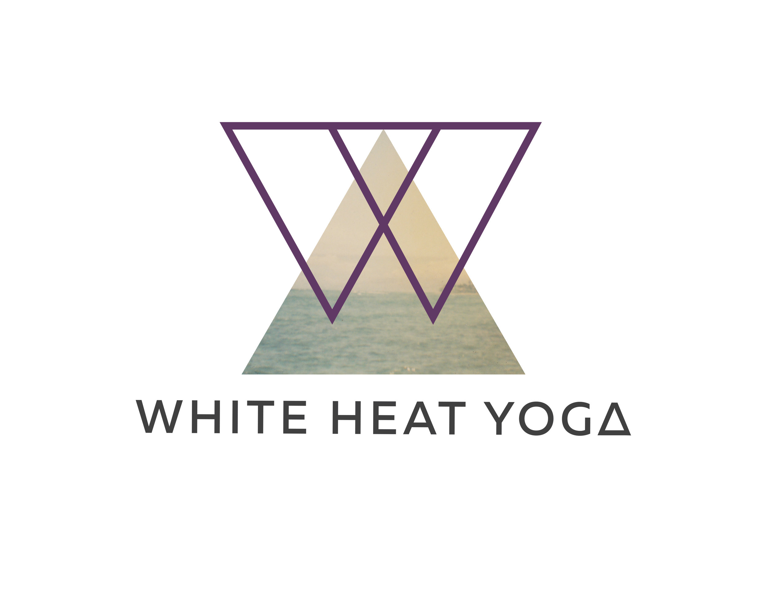
Jordan Severs, inspiring and energetic yoga teacher in the Los Angeles area was ready to open her own studio. She chose the name White Heat Yoga since a flame turns white at its hottest — the moment when that heat has the most power to chemically alter an element. Jordan wanted her studio to be about that moment of change and transformation: physically, emotionally, spiritually. I started with a manipulated delta — the symbol for change in mathematics and science.
Results + Metrics
LA has a plethora of yoga studios so White Heat Yoga needed to stand out to get enthusiasm from investors and real estate owners. By positioning her business and having a strong visual identity, Jordan secured a prime location. The build out reflects the branding: clean, modern, minimal.
Within the first week of opening White Heat Yoga booked every spot in every class. Many practitioners utilize the new client offer from the website and promotional card. In the coming quarter we will explore the studio’s 12-month growth.
Testimonial
The process with Kathleen was painless. My vision for White Heat Yoga was well-heard and precisely executed. The branding is really usable across platforms. Kathleen's branding helped inform the entire studio aesthetic, completing the vision.
- Jordan Severs, Owner